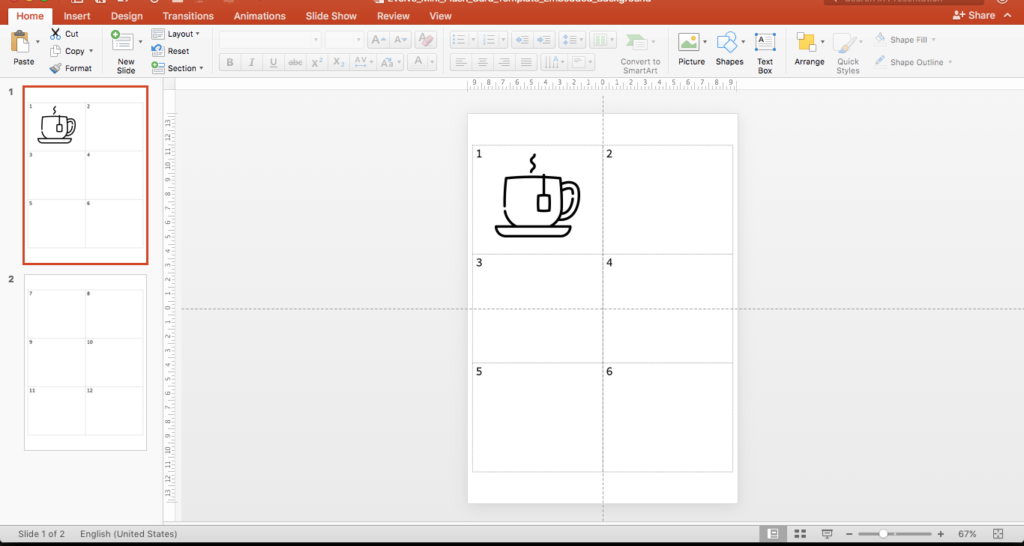
I recently updated my mini-flash card template. My school (and I suspect many teachers) create their mini-flash cards using Microsoft Word. However, I’ve found that to be problematic, often leading to mini-flash cards that are hard to work with (digitally), and not ending up exactly as I’d like them to look.
One of the challenges I’ve found, is that sometimes there would be hidden content (characters, images, and so on) in the Word document, that would make text entry or positioning of the graphics challenging. As a result it was hard to have everything looking consistent, and the mini-flash cards often looked unattractive.
So I redesigned my mini-flash card template from scratch, this time in PowerPoint.
Here are the steps I took:
- I created a new PowerPoint document and resized it to my paper size (A4, vertical).
- Inserted a (2×3) table and changed the line style to dashed, and removed all other formatting.
- Resized the table to take up the majority of the paper.
- Added in text boxes to number each of the mini flash cards, and aligned the text boxes for consistency.
- Exported the PowerPoint slide into an image (.PNG) format.
- I then re-imported that image back into the PowerPoint document, and set it as the background image.
- Finally, I saved the file as a template.
The advantage of saving the flashcard template as a background image means that I can drop and resize vector graphics or text boxes onto the template, and not disturb the alignment of anything else in the document. It also means I can use custom fonts for the mini flash card numbering and they will print on any system, regardless of whether the font is installed on that computer or not. Overall, I’m really happy with the outcome. It means my mini-flash cards will be much easier to create, and look a lot more professional.

